

Pepco Holdings, Inc.
Project Date: 2011 – 2016
Project Type: Corporate Rebranding
Situation
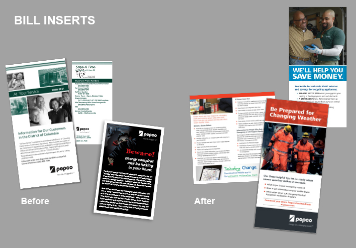
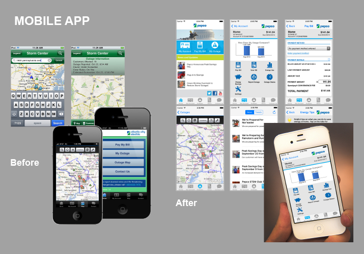
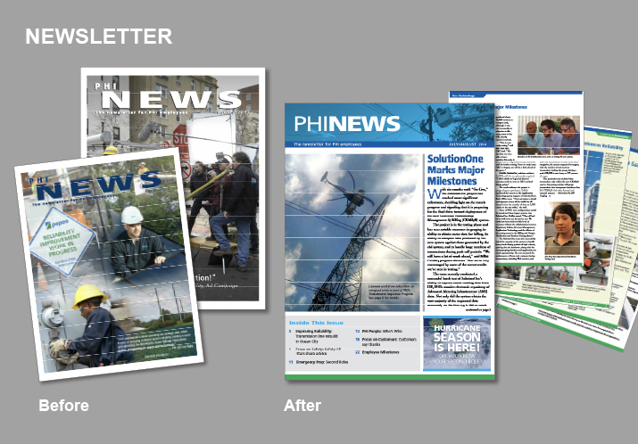
When Pepco Holdings, Inc. (PHI, NYSE: POM), was in the midst of its reputational crisis, one of the strategic communications initiatives we used to help repair the brand damage was an overhaul of the brand itself. The brand was outdated and fragmented; diluted by years of employing tactics that did not consistently follow brand standards. In addition, different taglines, several versions of the logo and a wide range of inconsistent advertising materials were featured in public at the same time. The absence of brand maintenance resulted in a lack of continuity or clear identity.
Because awareness of the company was high, it made sense to keep the names and logos for PHI and its subsidiaries. We focused instead on completely rebuilding the voice, tone and style of the brand to ensure it was contemporary and engaging, and 100-year old utility companies were seen as current. We also added an updated tag line that was relevant to the reputational repair effort.
Our goals for this massive initiative were to create a strong and consistent brand that would support our overall efforts to restore the company’s image and reputation, improve customer satisfaction, and reposition PHI in the industry – and all without an additional rebranding budget.
Strategy
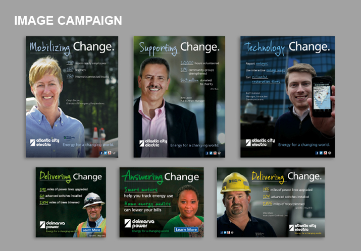
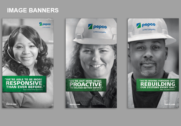
As with most of our efforts, we first turned to research to understand what customers knew about the company and what the updated brand needed to convey so they had a more positive opinion and would become more engaged. Because customers had little faith in the company at that time, they did not believe work was actually being done to enhance the electric system reliability that was at the center of the reputational issues. In fact, the only way they would trust that improvements were being made is if they saw the “real people doing the real work.”
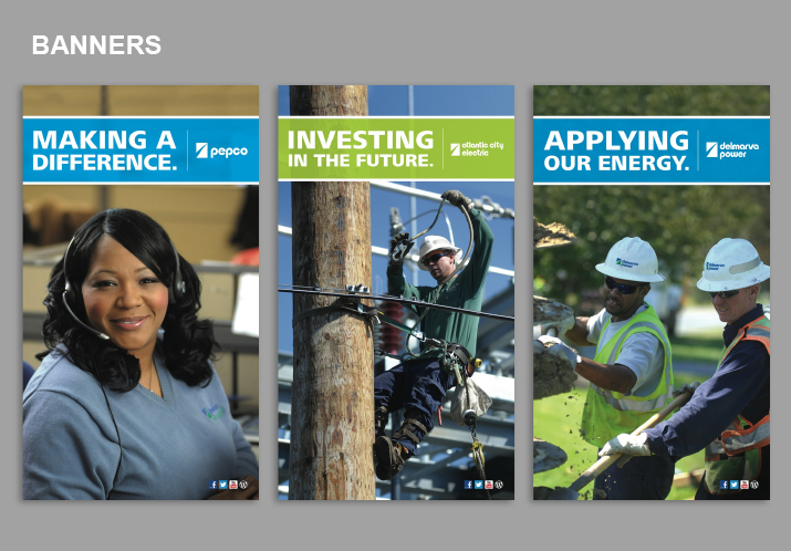
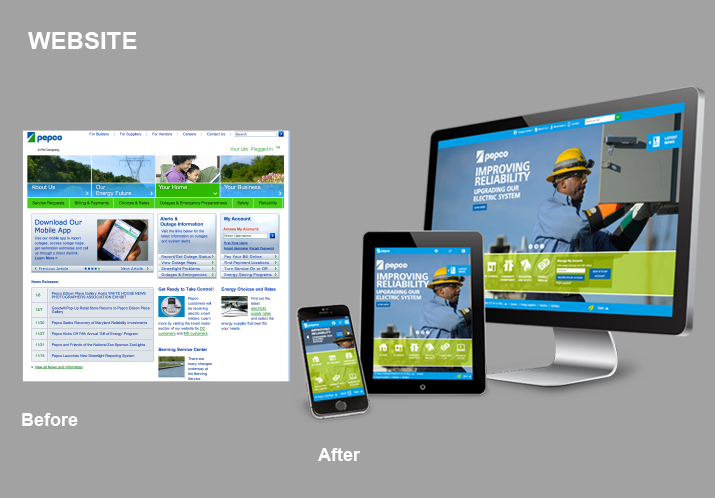
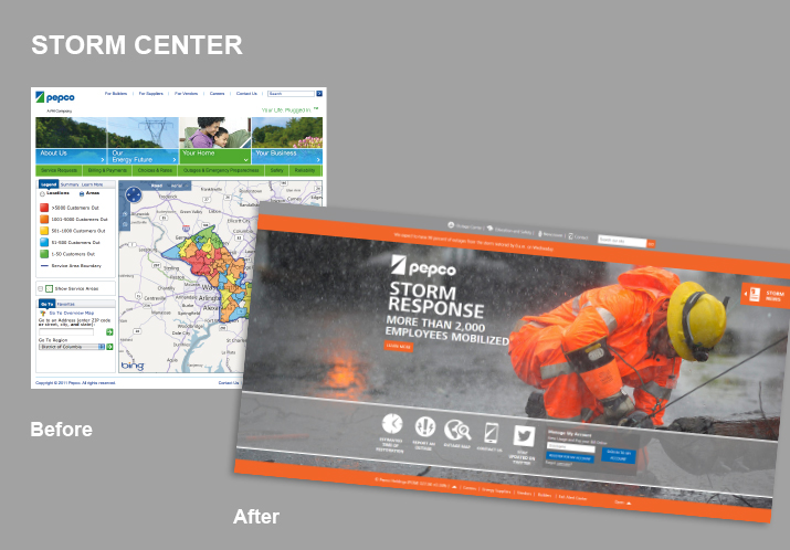
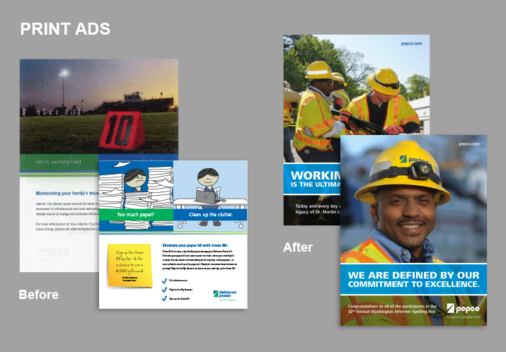
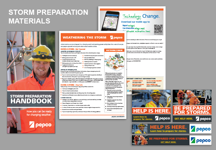
The new brand was created with a contemporary palette, conversational and engaging voice and tone, and imagery that showed front line workers digging trenches and installing new lines and poles, customer service representatives answering calls, and utility subsidiary employees doing community service. Thousands of new, custom photos were shot and replaced the typical electric utility imagery of light bulbs, appliances and glowing homes. The new photos told stories of hard work, commitment and a connection to the community.
Simultaneously, we wrangled in every use of the brand across the PHI footprint and educated the business on the need for Communications’ ownership of everything from PowerPoint templates to internal posters to T-shirts for volunteer events. The consistency of the brand internally and externally meant that all materials would serve to repair the brand and create brand advocates.
Results
The rebranding effort at PHI yielded an award-winning and engaging style, noticeable consistency across the PHI footprint, internal alignment and a change in brand strategy that others throughout the electric industry began to consider as a best practice model. Specifically:
- Awards
The effects of the rebranding project have yielded more than 220 awards between 2012 and 2016, including a prestigious REBRAND 100 award in 2016 - Photos
Employees proudly represented the “real work” in over 3,000 new photos - Rebranded materials
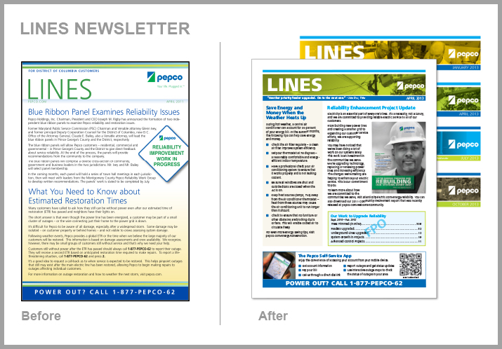
Website, social media channels, more than 1,500 ads, collateral, posters and templates were created to bring the brand to life - Industry recognition
Engaged with electric utilities from Alaska to Florida about changes in brand strategy to assist in their brand updates - Budget
No additional funding needed; accomplished entire rebrand through normal course of business